
Track Your Productivity Using Outlook Categories and Power BI (Desktop)
Posted on June 12, 2022 • 4 minutes • 802 words
Table of contents
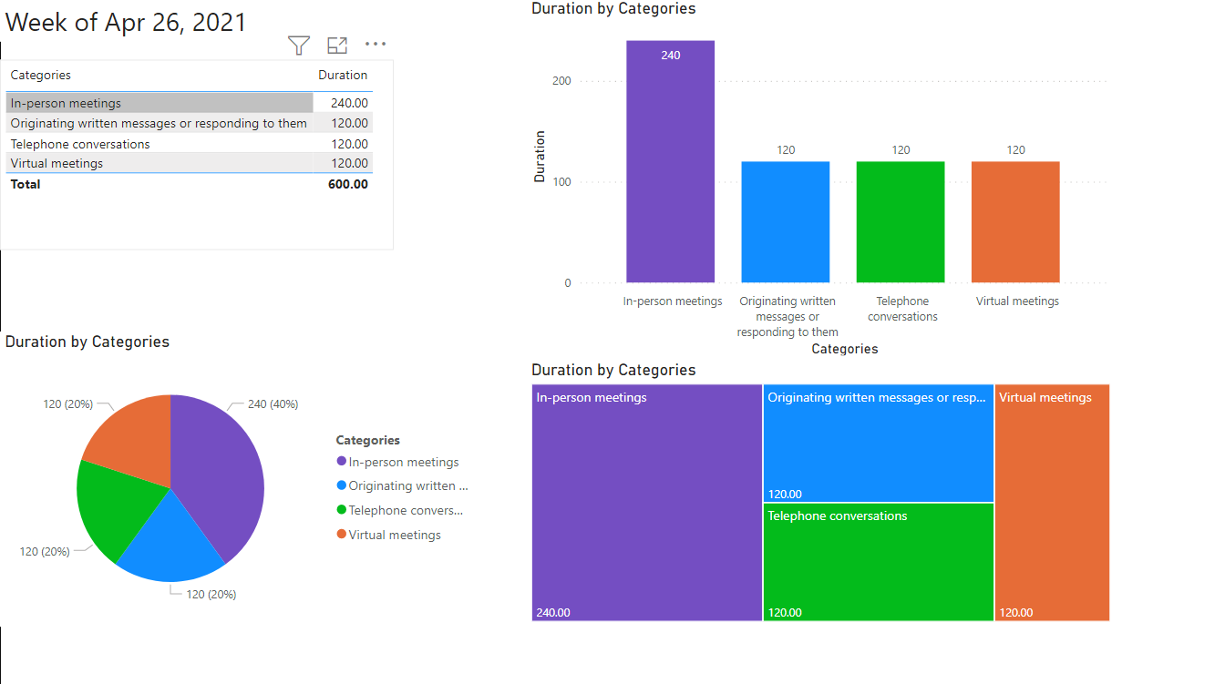
Basic Category Visualization
- Start creating data to gather by creating your Outlook categories and categorizing all of your appointments and meetings over a period of time.
- Download Power BI Desktop for free and open it up
- Click “Get Data”
- Search for “Exchange” and connect to “Microsoft Exchange”
- Put in your email address that you want to connect
- The first time you do it, you will have a screen to connect via Exchange or Microsoft. I recommend picking Microsoft and clicking “Connect”
- You now select the “Calendar” checkbox
- Click “Transform Data”
- Click “Choose columns -> Choose columns”
- Check the “Select all” box to deselect all of the columns
- Select the four following columns: Subject, Start, End, Category
- On the Category column, click the button with the two outward arrows
- Click “Extract values”
- Click “Ok” without selecting a delimiter
- Go to the Add Column menu
- Click “Add Custom Column”
- Call the custom column “Duration”
- Put the following code in: = [End] – [Start]
- Click “Ok”
- Right click the header of your new Duration column
- Click “Transform” and “Total Minutes”
- Click on the down arrow on the Start column
- Hover over Date/Time Filters and then go to what you want to select. In my example, Date/Time Filters -> Week -> This Week
- Click “Close and Apply”
- Add charts as desired
- When you’ve created a dashboard you like, save the file
- You can click “Add a text box” and put a title on your dashboard
- To share with others easily, click “File -> Export -> Export as PDF”
- To change your dates, click “Transform Data”
- Either clear your Date/Time Filter or click the red X on the right side next to the step where you filtered the rows
- To deal with holidays, you can remove specific rows or just right click and exclude data without a category from each visualization
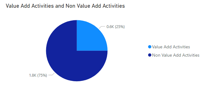
Adding Value Add vs Non Value Add Comparison
- Click “New Measure” in Power BI
- Type in this formula: Value Add Activities = sum([Column: Duration])
- Click “New Measure” again
- Type in this formula: Non Value Add Activities = 2400 – ([Value Add Activities])
- Create a new visualization and only select the two new measures, Value Add Activities and Non Value Add Activities
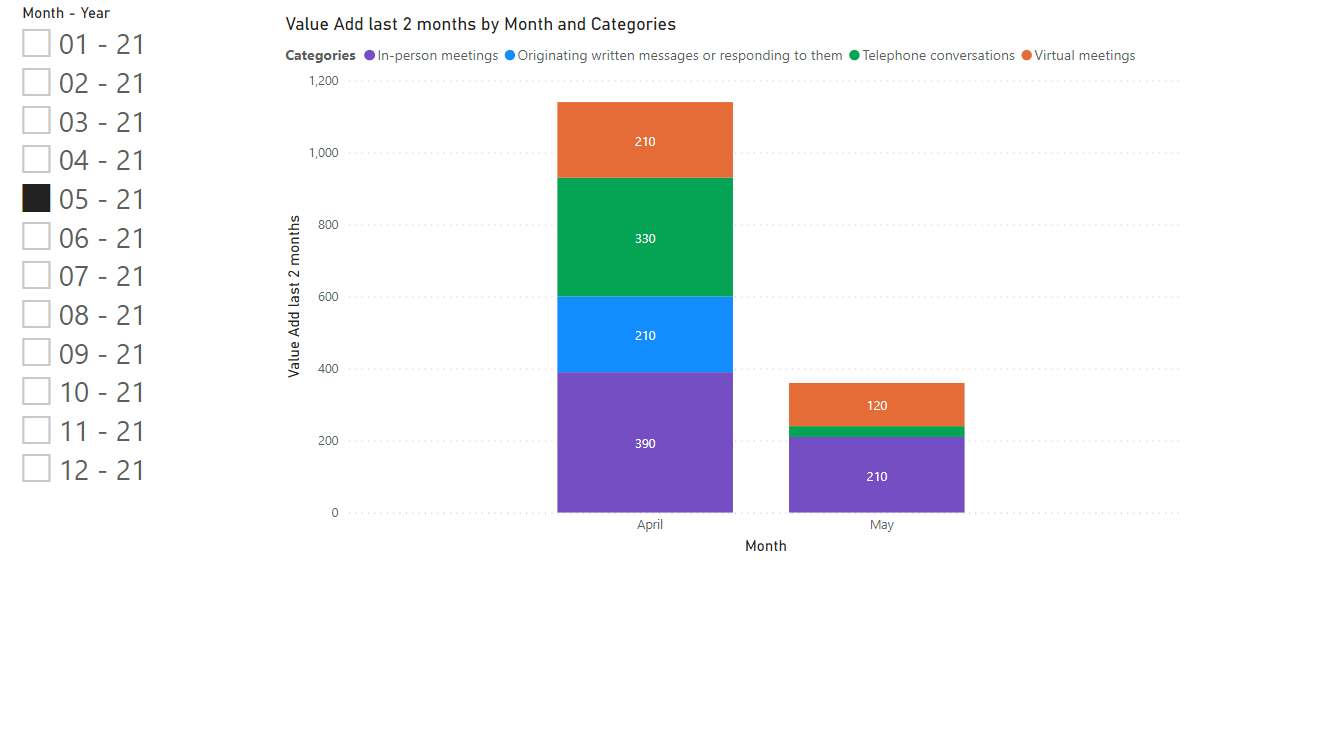
NEW: Tracking Longitudinal Growth Over Time
Our client had an additional ask – how do we see in one visual how someone is performing in the categories over a span of time? Here are the steps I walked through to create my end visual:
- (Optional) Add a new page at the bottom by clicking the yellow/orange plus sign
- Click “Data” on the left
- Click “New Table”
- Clear the field and paste in this code for DimDate (dates can be changed as needed): DimDate = ADDCOLUMNS(CALENDAR(“01/01/2022″,”31/12/2022″),”Month – Year”, FORMAT([Date],”mm – yy”),”SortMonth”,FORMAT([Date],”yyyymm”))
- Hit the green checkmark to create this new table
- Click “Report” on the left
- Click “Transform Data”
- Click the Start column
- Select “Add Column” menu
- Click Extract -> Text Before Delimiter
- Type in a single space as the delimiter
- Click “Ok”
- Select the new Text Before Delimiter column
- Click Date -> Parse
- Remove the date filter on the Start column by clicking the red X next to “Filtered Rows” under “Applied Steps” and then “Delete”
- Add a date filter on the Start column of Year -> This Year
- To remove holidays, go back to the “Home” menu
- Click “Keep Rows -> Keep Range of Rows”
- Put in the range of rows with valid meetings
NOTE that during my session, Daryl Rasmussen suggested creating a “Holiday” category and then filtered to exclude that category, so another method to try out!
- Click “Close and Apply”
- Click “New Measure”
- Clear the field and paste in this code for Value Add Activities Last 3 Months: Value Add last 3 months = CALCULATE(SUM(‘Calendar’[Duration]),FILTER(ALL(‘Calendar’[Parse]),’Calendar’[Parse]<=MAX(DimDate[Date])&&’Calendar’[Parse] >= EDATE(MAX(DimDate[Date]), -3)))
NOTE – this is for the last three months. To make it more or less, change two things in the code – the name of it, and that “-3” at the very end to the count of months you want to calculate for
- Create a Slicer visualization and drag to the left of the screen
- With that visualization selected, check the boxes under Fields for DimDate (expand it) -> Month-Year
- (Optional) Increase the font size by clicking Format under Visualizations (the roller paint brush), Items, and Text Size – adjust accordingly
- Created a Stacked Column Chart visualization
- With that visualization selected, under the Calendar table, check the boxes for “Parse”, “Value Add Last 3 Months”, and “Categories”
- Under the Visualizations section, where it says Axis -> Parse, click the X next to “Year”, “Quarter”, and “Day”
- Select your current month in the slicer and start playing from there!
If you have any further questions, please feel free to reach out to me at @lshelton_tech on Twitter and I will do my best to help!